Facebook Gaming
A Unified Visual Identity for the World's Gaming Community
After years of legacy logos and lingering FarmVille associations, Facebook Gaming needed a cohesive visual brand—welcoming to casual gamers yet credible with core gaming audiences. As Creative Director on Facebook's brand team, partnered with design agency Collins to develop the new identity system.
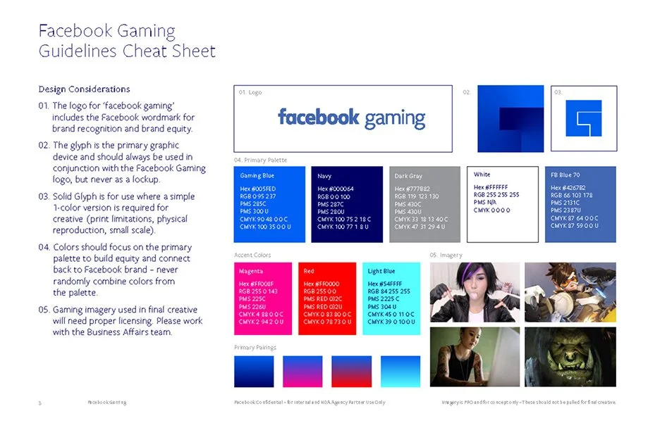
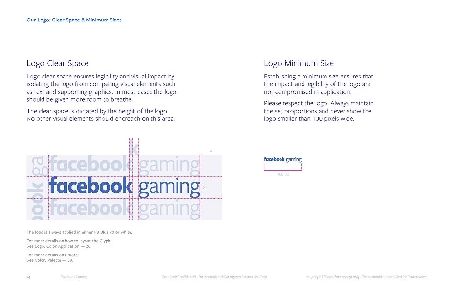
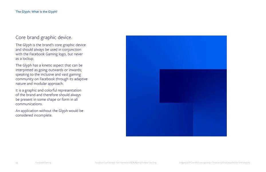
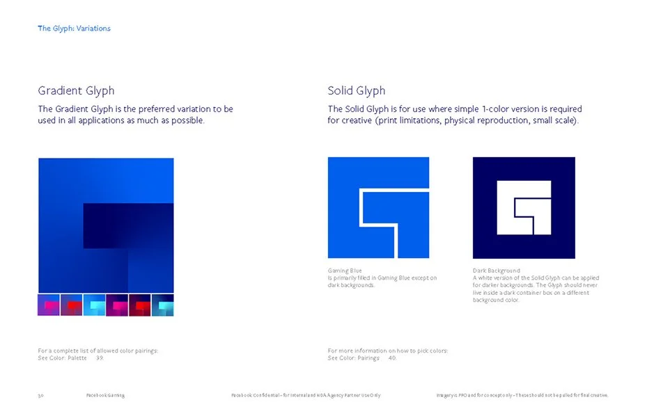
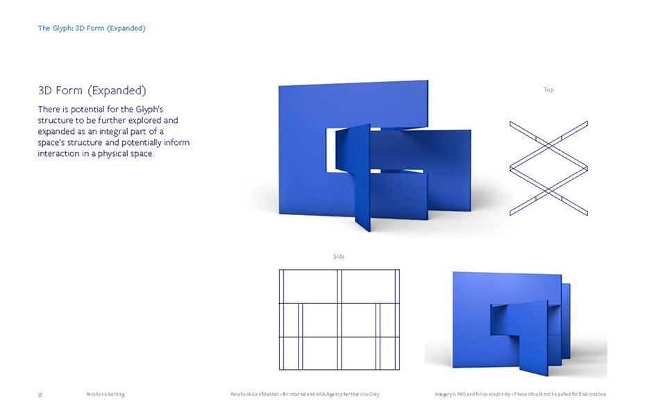
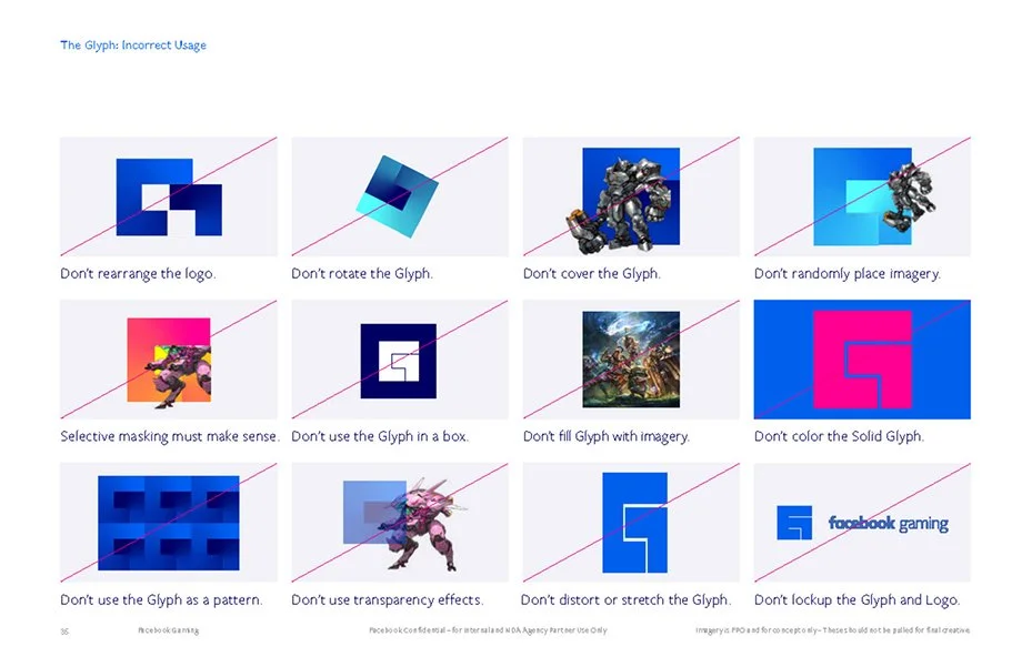
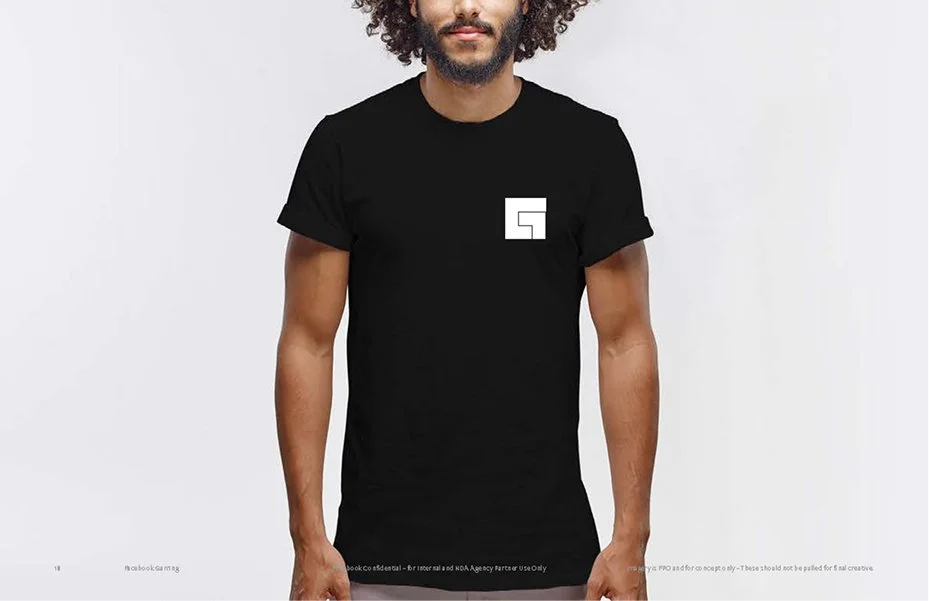
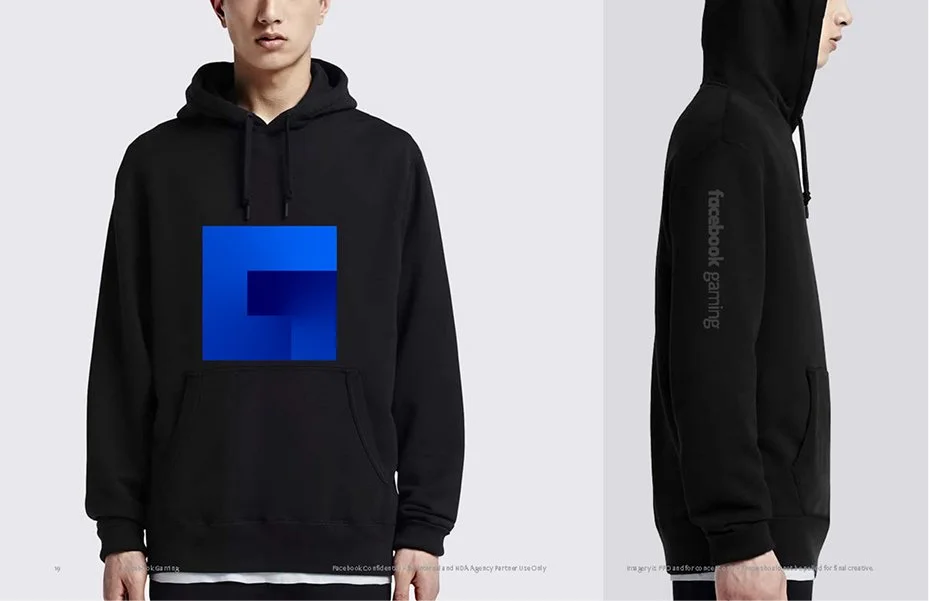
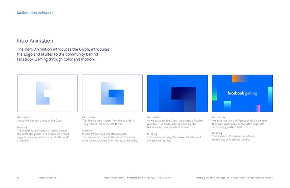
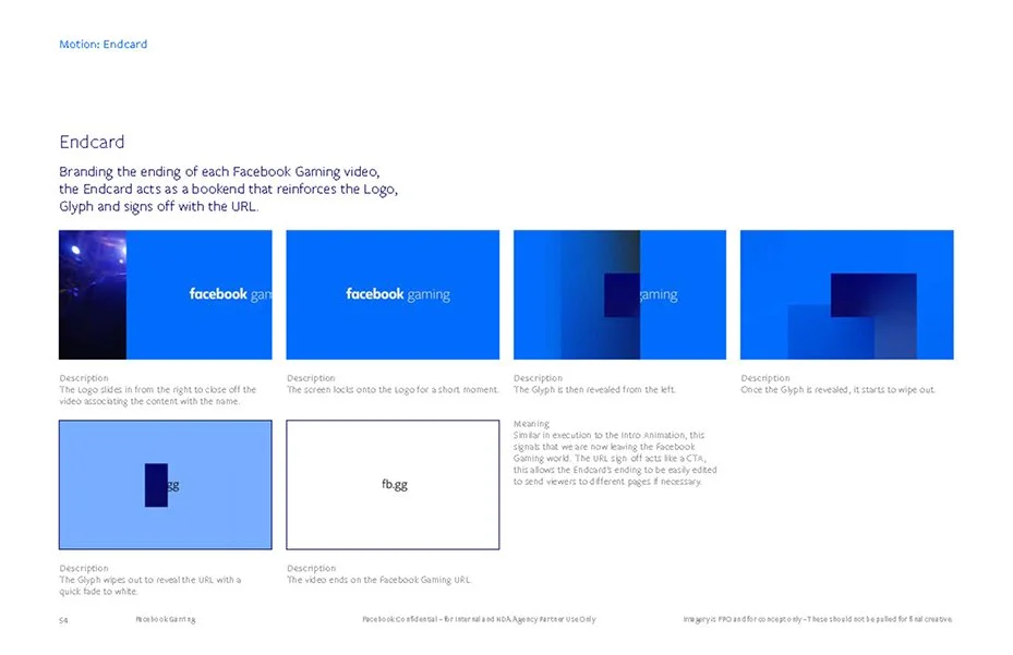
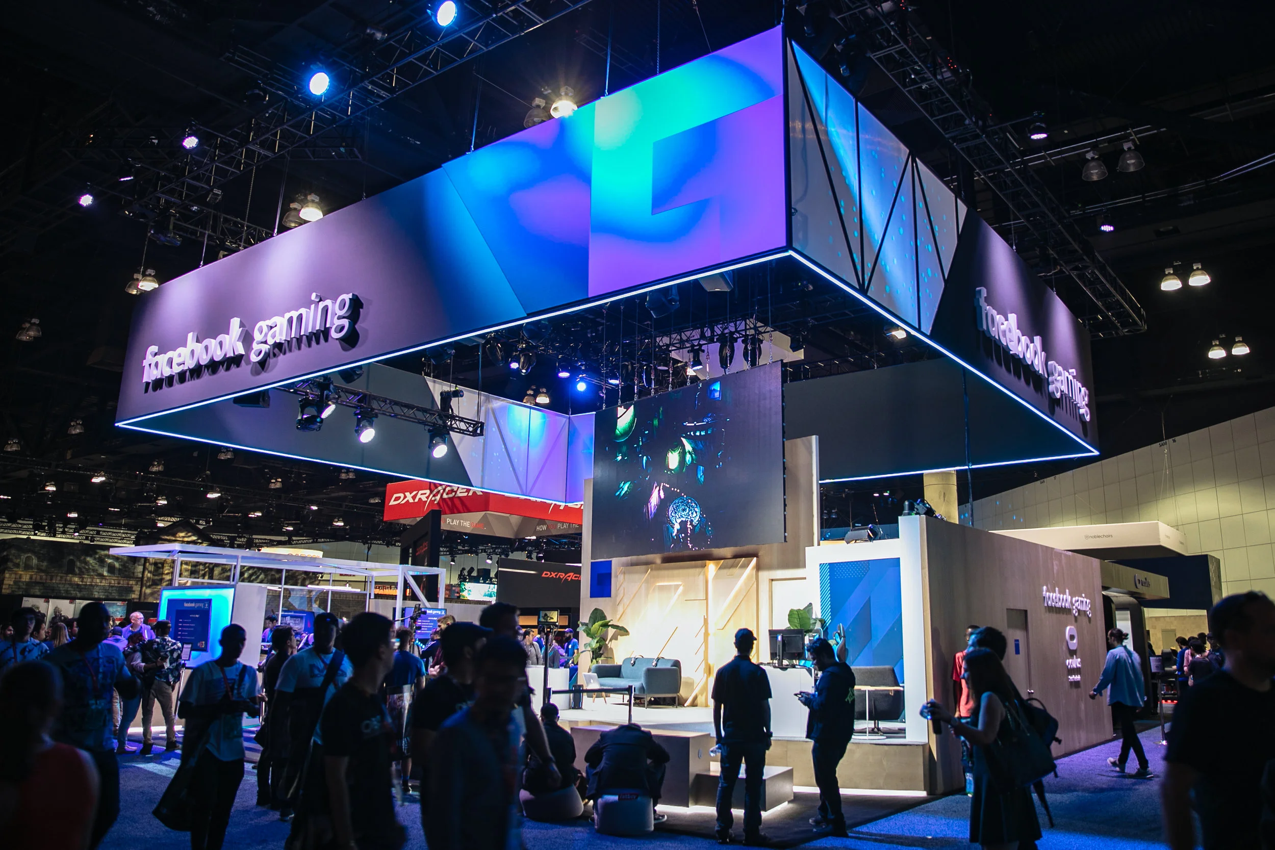
The solution: an adaptive, modular glyph that evokes how Facebook assembles different gaming communities on one platform. Rooted in Facebook Inc.'s broader brand but pushing color and visual language in new directions for gaming audiences. The glyph pairs seamlessly with partner and creator IP, reinforcing Facebook's role as a platform for the broader ecosystem of creators, developers, and publishers.
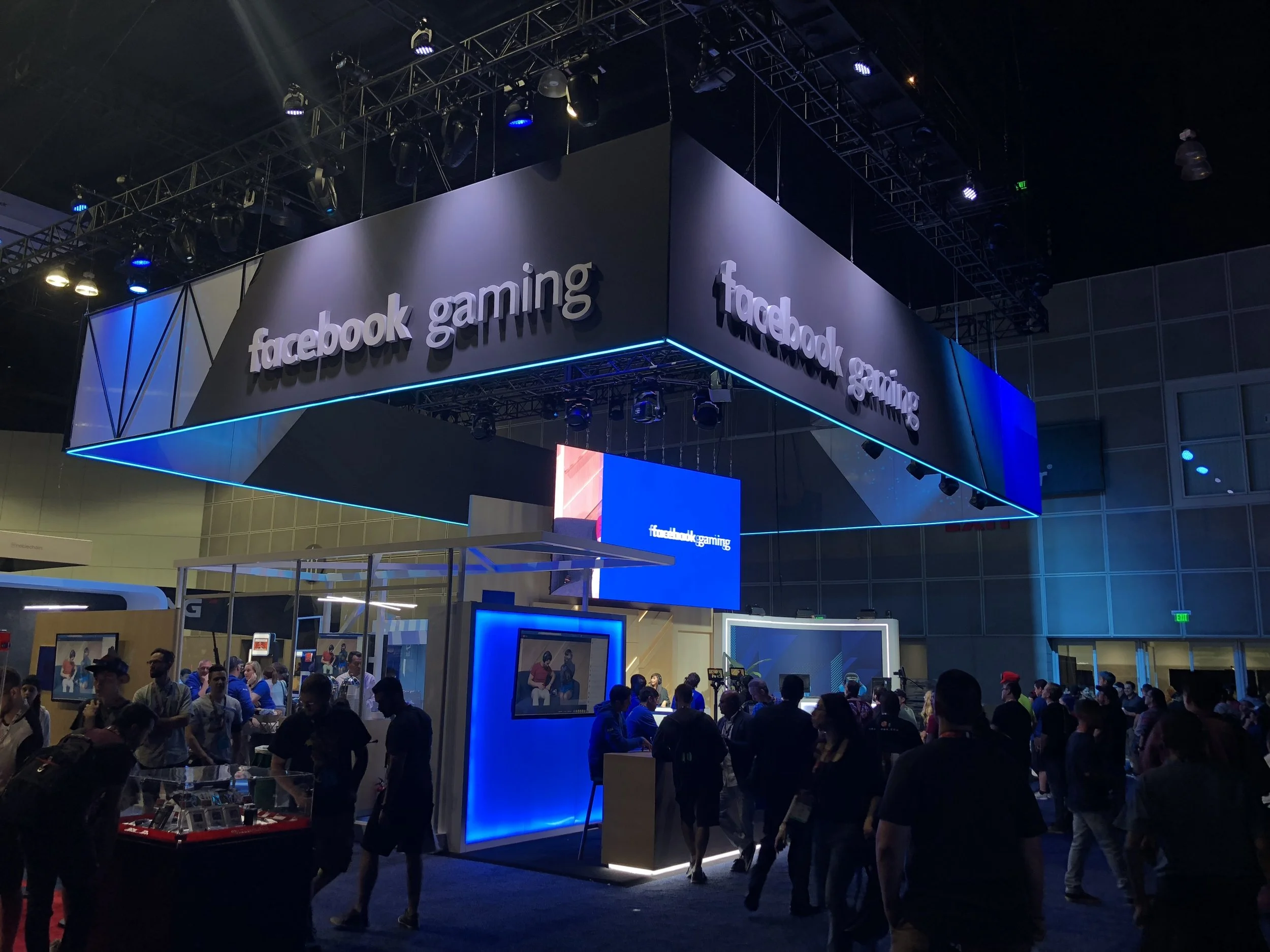
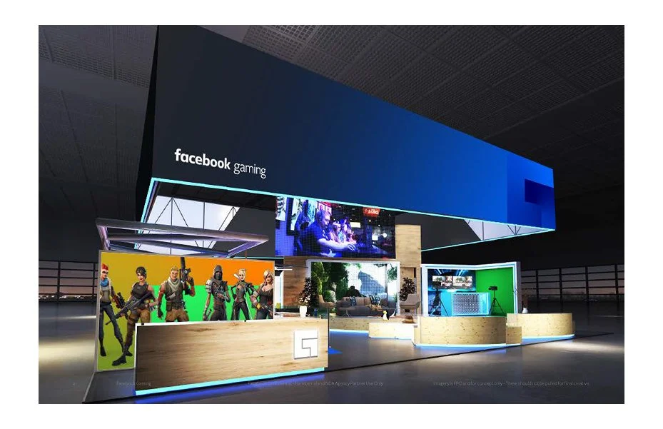
The identity debuted at E3 2018 and rolled out across the Facebook Gaming booth, launch events, and redesigned Creators website.
Impact: Launched June 1, 2018; 210% increase in viewership year-over-year by December 2019. Scaled to 350M monthly active users and became the third most-watched gaming platform globally. Press: TechCrunch, Fortune, Adweek, TechRadar, Engadget, VentureBeat.
Role: Creative Director (Facebook), Brand Identity, Visual Strategy
Agency Partner: Collins
